While Leasepoint has always delivered powerful aviation asset management capabilities, Leasepoint v10 introduces a significantly enhanced user experience designed to make information easier to access, analyse, and act upon.
The screenshots below demonstrate how the platform is being continuously refined from a functional enterprise application into a modern, user-centric workspace.
“Leasepoint v10 is not simply a new look and feel. It represents a complete evolution of the user experience, combining powerful aviation asset management functionality with a modern interface designed to improve productivity, visibility, and decision-making.”
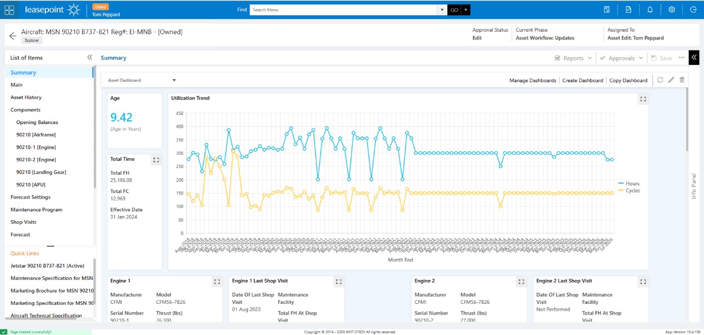
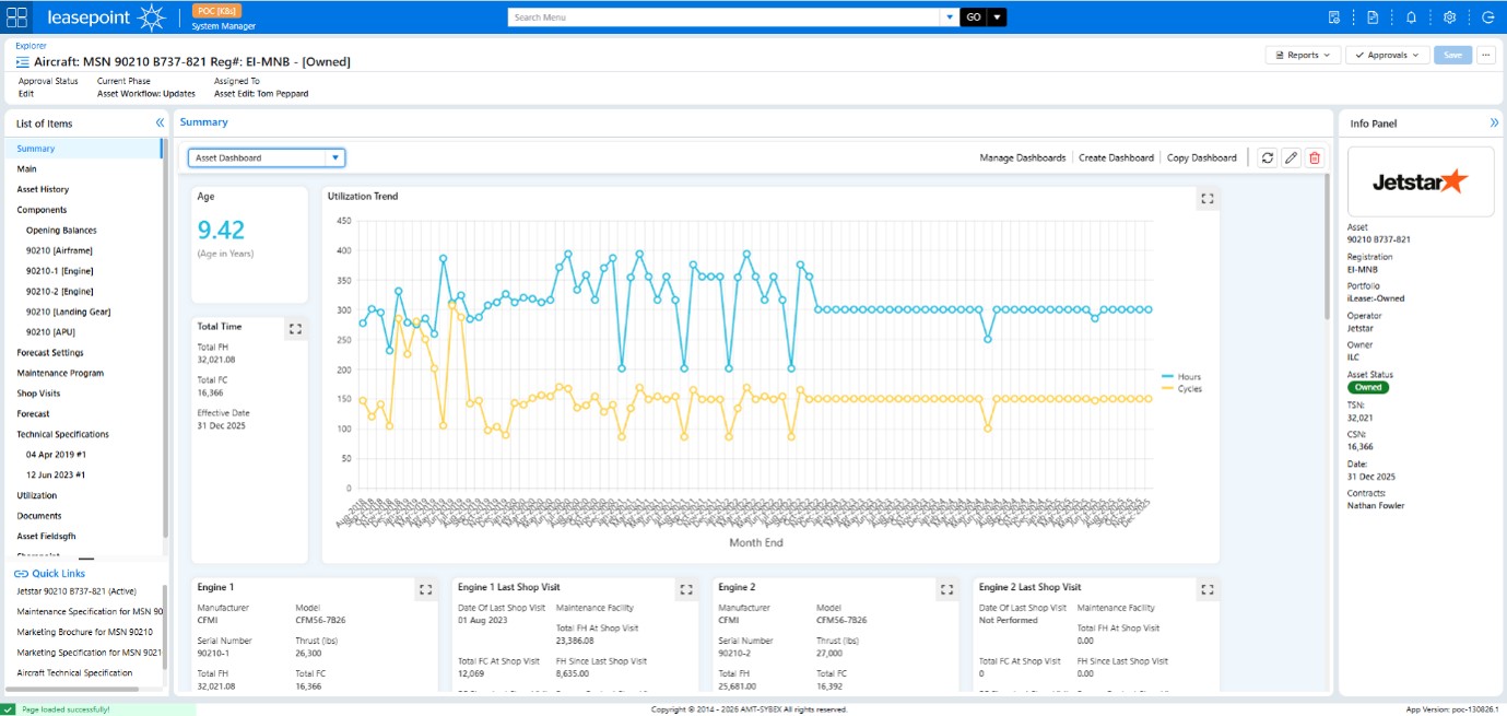
Asset Management Screen
Before
After
What Changed?
The Asset Summary screen has undergone several important enhancements:
✅ New Contextual Information Panel
A dedicated information panel now provides instant access to critical aircraft information, including operator, registration, owner, asset status, flight hours, and cycles without navigating away from the current screen.
✅ Improved Information Hierarchy
Important metrics such as aircraft age, utilisation, and engine performance are more clearly grouped and visually separated, making the screen easier to scan.
✅ Better Dashboard Management
Dashboard controls now have a cleaner presentation, with management actions clearly separated from operational data.
✅ Reduced Visual Clutter
The previous interface contained several competing navigation and action areas. The new version provides a cleaner layout while maintaining access to all functionality.
Business Benefit
Users spend less time searching for information and more time analysing aircraft performance, maintenance status, and asset value.
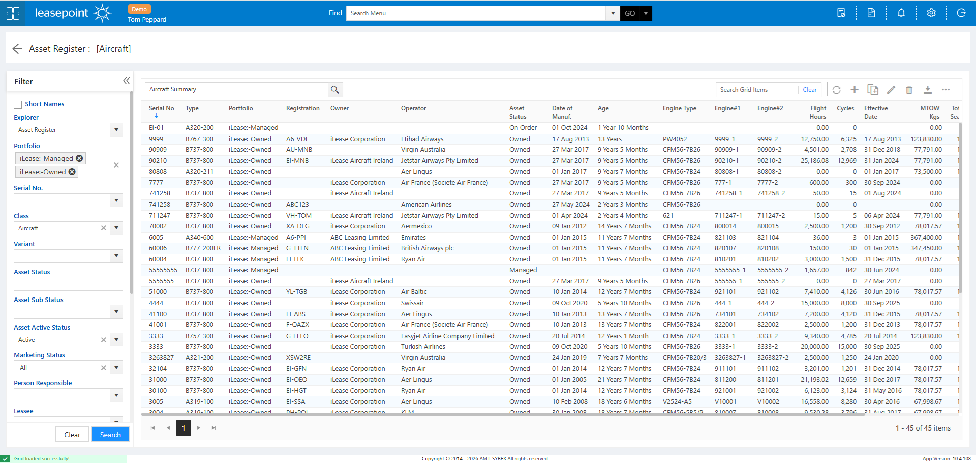
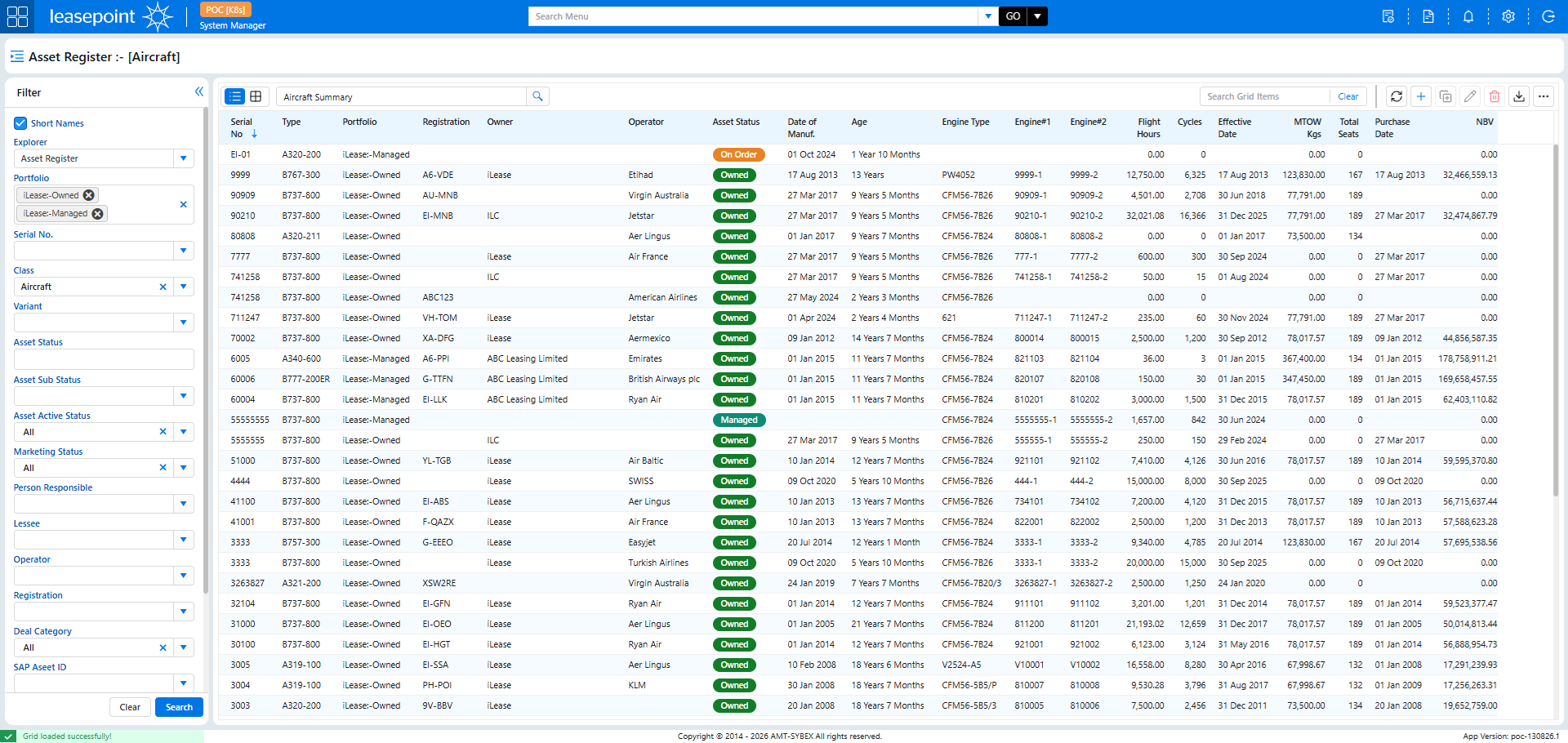
Asset Register (Explorer)
Before
After
What Changed?
The Asset Register remains one of the most frequently used areas of Leasepoint and has received major usability enhancements.
✅ Modern Grid Experience
Improved spacing, typography, and alignment make large datasets easier to read and navigate.
✅ Colour-Coded Status Indicators
Asset statuses are now displayed using visual badges such as:
Owned
Managed
On Order
This allows users to identify asset status instantly without reading every record.
✅ Enhanced Action Toolbar
Common actions such as Add, Edit, Refresh, Export, and Delete are easier to access and consistently positioned.
✅ Improved Search and Filtering Experience
The filtering panel has been streamlined, while the data grid has been expanded to maximise available viewing space.
Business Benefit
Users can review larger portfolios more efficiently and identify relevant assets faster.
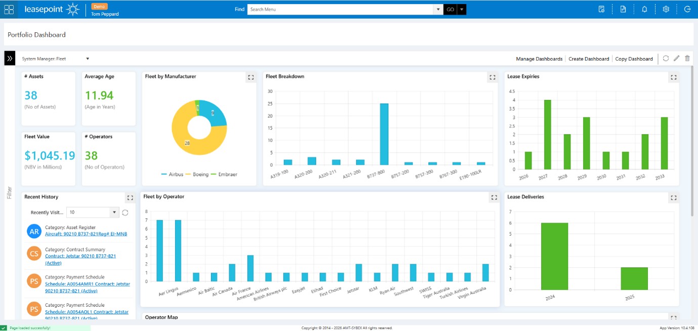
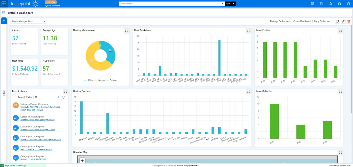
Portfolio Dashboard
Before
After
What Changed?
The Portfolio Dashboard has evolved into a richer management and analysis experience.
✅ More Prominent KPI Cards
Key portfolio indicators such as:
Number of Assets
Fleet Value
Average Age
Number of Operators
are now easier to consume at a glance.
✅ Improved Data Visualisation
Charts have been refined with improved spacing and presentation, making trends easier to interpret.
✅ Enhanced Management Controls
Dashboard administration functions have been integrated more seamlessly into the user interface.
✅ Better Workspace Utilisation
The dashboard now uses available screen space more effectively, creating a cleaner and more balanced experience.
Business Benefit
Senior management and asset managers can gain portfolio insights more quickly and with less effort.
Key UX Improvements Across Leasepoint v10
The redesign was driven by five core principles:
Faster Navigation
Users reach information with fewer clicks and less screen switching.
Better Context
Information panels and visual indicators reduce the need to navigate between records.
Greater Visibility
Important information stands out through improved hierarchy and visual design.
Consistent Experience
Common actions, layouts, and controls remain consistent throughout the platform.
Improved Productivity
Every enhancement was designed to help users complete tasks faster while reducing cognitive load